Talk

How to Build a Brand Voice from Scratch: A Startup Case Study
How do you give a startup a soul? When a company is brand new, it isn't just looking for a logo or a color palette; it's searching for its voice, its identity, and its core narrative. This was the challenge at Moonbeam, an early-stage creator platform I joined as Curation Director. We had a brilliant product vision and a growing beta community, but we lacked a cohesive brand identity. Our messaging was inconsistent, our tone was undefined, and our visual language didn't yet reflect the vibrant community we were trying to build.
My mission was to lead the development of Moonbeam's foundational brand identity. This was a "zero to one" project. It wasn't about optimizing an existing brand; it was about excavating the company's core truth and translating it into a tangible, scalable system for communication.
Over a single quarter, I led a collaborative process with leadership to define the brand's core narrative, voice, tone, and messaging pillars. This new identity became the bedrock of our content marketing strategy, boosting our social reach by 35% and serving as the foundation for the user journey redesign that would later increase platform retention by 30%. This is the story of how we found Moonbeam's voice.
The Journey: The Brand as a Character
Building a brand is like writing a character. Before you can know what they say (messaging) or how they look (visuals), you have to know who they are. My process was built on this foundational principle of character development.
Phase 1: The Discovery (The Character's Backstory)
I began not with design, but with questions. I facilitated a series of workshops with the company's founders and key stakeholders. These weren't typical marketing meetings; they were deep, probing interviews designed to unearth the company's DNA.
We used a framework I developed called the "Brand Archetype Matrix," asking questions like:
- If our brand walked into a party, who would it talk to? What would it wear?
- What is the one thing our brand believes that no one else does? (Our "Unconventional Truth")
- What is our brand's greatest fear? (e.g., "That our creators will feel isolated.")
- Who is our brand's "enemy"? (Not a competitor, but an idea, like "Creative Gatekeeping" or "The Myth of the Lone Genius.")
The answers to these questions were incredibly revealing. A clear personality emerged: Moonbeam was not a slick, corporate "platform." It was a passionate, supportive "collaborator." It was the encouraging and knowledgeable peer who believed in your potential, not the intimidating industry guru.
Phase 2: The Codification (The Character's Voice)
With a clear character defined, the next step was to codify its voice. I translated the insights from the discovery phase into a formal Brand Voice & Tone Guide. This became our internal rulebook for all communication.
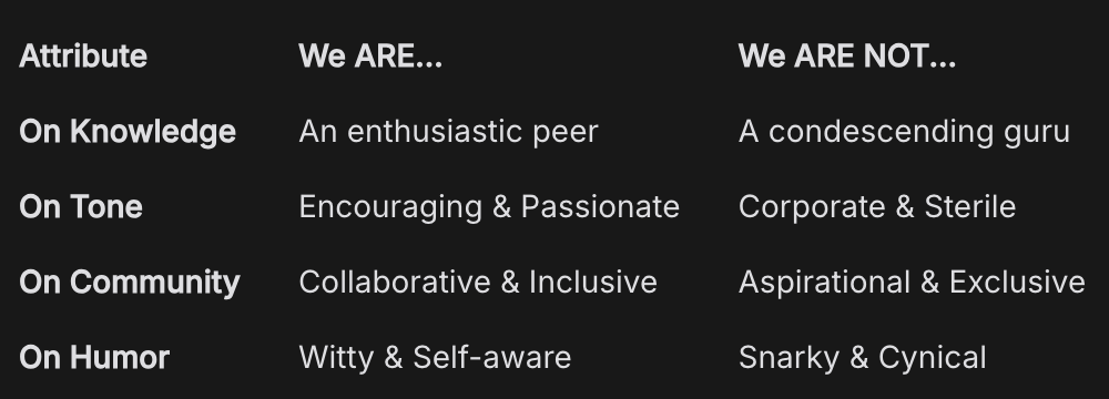
The guide was built on a simple, actionable matrix: "We are... / We are not..."
AttributeWe ARE...We ARE NOT...On KnowledgeAn enthusiastic peerA condescending guruOn ToneEncouraging & PassionateCorporate & SterileOn CommunityCollaborative & InclusiveAspirational & ExclusiveOn HumorWitty & Self-awareSnarky & Cynical
This guide also included a Brand Lexicon (words we use, like "collaboration," "spark," "community," and words we avoid, like "synergy," "platform," "users") and practical examples of the voice in action, from UX microcopy ("Let's get started!") to social media captions. This document was the key to empowering our entire team to communicate with a single, consistent voice.
Phase 3: The Expression (The Character's Wardrobe)
Only after the character and voice were defined did we move to the visual identity. I collaborated with our design lead to ensure the visuals were a direct expression of our newly defined personality.
- Color Palette: We chose a warm, energetic, and accessible color palette that felt more like a creative's notebook than a tech platform.
- Typography: We selected fonts that felt modern but also personal and slightly quirky, avoiding the cold, geometric sans-serifs common in the tech world.
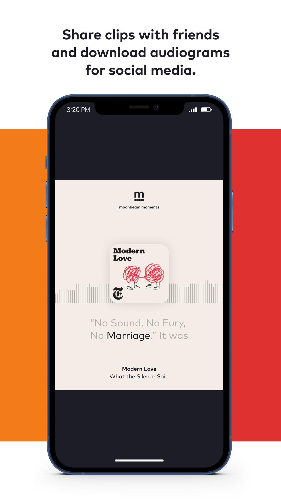
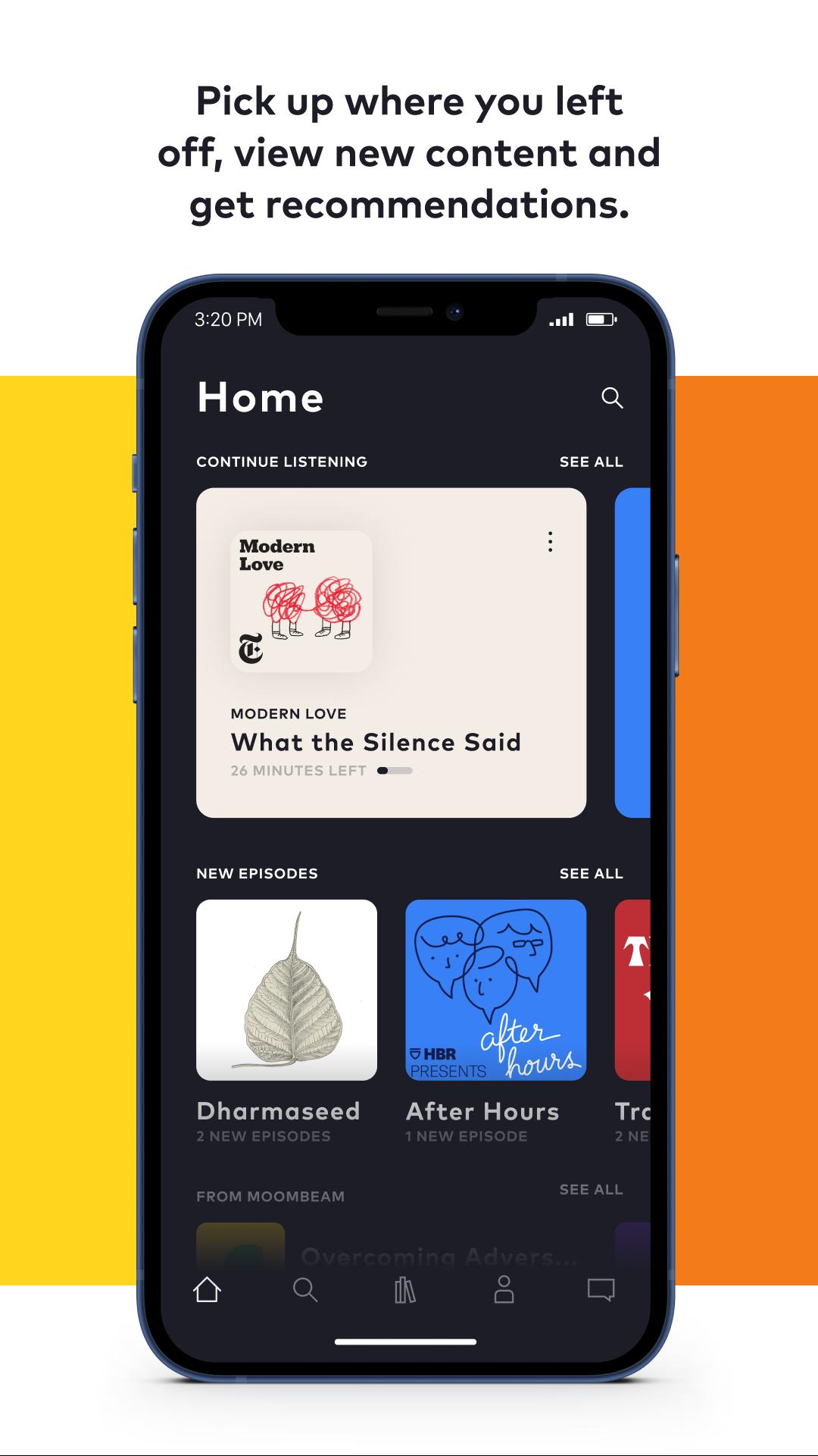
- Imagery: We made a crucial decision to ban generic stock photography. Our visual language would be built on illustrations and, more importantly, on showcasing the real work of our actual community members.
This three-phase process—Discover, Codify, Express—ensured that our brand identity was not a superficial layer of paint. It was an authentic expression of the company's core mission, built from the inside out.
.jpg)
The Results: A Cohesive Identity that Fueled Growth
The establishment of a clear, codified brand identity acted as a powerful accelerant for the entire business. It provided the clarity and consistency we needed to scale our marketing efforts and deepen our connection with the user base.
The Metrics of a Strong Foundation:
- Social Reach Boosted by 35%: With a newly defined, consistent, and more engaging voice, our content marketing strategy found its footing. Our social media engagement and follower growth accelerated, leading to a 35% increase in overall social reach in the quarter following the brand rollout. Our content was now recognizable and resonant.
- Foundation for a 30% Retention Lift: This brand work was the essential precursor to our successful user journey redesign. The "Collaborator" persona we defined became the North Star for all UX writing and communication touchpoints. The empathetic, encouraging voice we codified was the key to making the new feedback and content loops feel authentic and engaging, directly contributing to the subsequent 30% increase in user retention.
- Internal Alignment and Efficiency: The Brand Voice & Tone Guide became one of the most used documents in the company. It dramatically reduced the time spent debating copy and design choices. It empowered every team member, from marketing to product to support, to communicate with a unified voice, creating a more cohesive and professional user experience across the board.
The Strategic Win:
By investing in this foundational brand work, we did more than just create a style guide. We created a strategic asset. We built a brand that our audience could form a genuine emotional connection with. This wasn't just a platform anymore; it was a partner. This deep sense of brand loyalty and trust was the bedrock upon which all our future growth—in audience, retention, and eventually revenue—was built.
1Three Truths About Building a Brand's Soul
- Identity Precedes Expression: The most common mistake startups make is choosing a logo and a color before they know who they are. This project proved that a successful brand is built from the inside out. You must codify your mission, your values, and your personality before you ever touch a design file. The "why" always comes before the "what."
- A Brand Guide is an Empowerment Tool, Not a Straitjacket: Some creatives fear that brand guidelines will stifle their creativity. We found the opposite to be true. By providing a clear framework and a consistent voice, the brand guide actually liberated our team. It removed ambiguity and gave them the confidence to create, knowing they were building on a solid, strategic foundation.
- Your Brand's "Enemy" is Your Most Powerful Storytelling Asset: The most clarifying exercise in our discovery phase was defining our brand's "enemy"—the idea we were fighting against. For us, it was "Creative Gatekeeping." This single concept gave us a powerful, unifying narrative. Every piece of content, every feature we built, became an act of rebellion against that enemy. A brand that stands for something is good, but a brand that stands against something is unforgettable.
Building a brand from zero is a rare and rewarding challenge. It's an act of turning abstract beliefs into a tangible, living personality that can connect with thousands of people. It's the ultimate exercise in strategic storytelling.
Lessons Learned
Good To Know
Bouwen jullie ook een e-commerce webshops?

Bouwen jullie alleen in Webflow of ook met andere tools?
Wat gebeurt er na de oplevering van mijn website?
Wat houdt CRO precies in en wat levert het op?
Wat zijn AI agents en hoe kunnen ze ons helpen?
Kan ik ook één onderdeel (bijv. alleen development) afnemen?
Werken jullie ook samen met interne teams of bureaus?