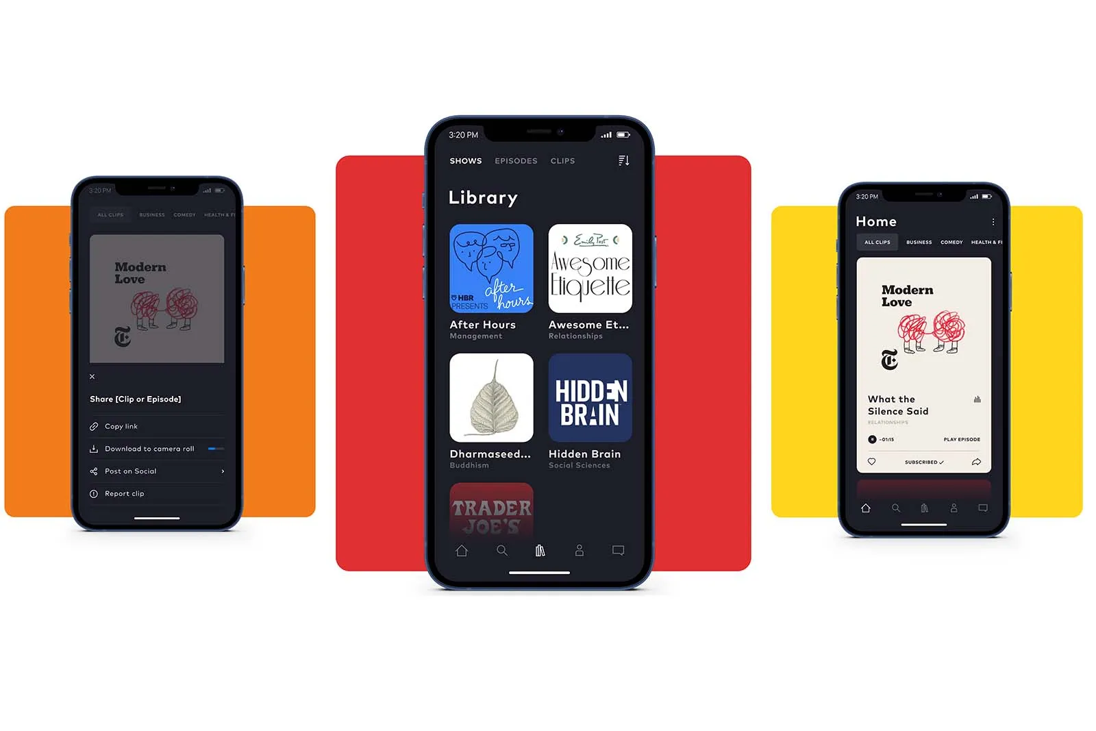

It’s the question that keeps every founder and product manager up at night: how do you get people to stay? You can build a beautiful product, attract thousands of users, and have a brilliant mission, but if your platform is a leaky bucket, none of it matters. This was the precise challenge facing Moonbeam, an innovative, early-stage platform designed to help creators find and collaborate with one another.
When I joined as Curation Director, Moonbeam had a passionate user base and a fantastic core product. But our user retention numbers were flat. Users would sign up, get excited, and then… drift away. They were struggling to find the right collaborators, missing key platform updates, and weren't experiencing the "magic moment" of a successful connection quickly enough.
The problem wasn't the product's value; it was the product's narrative. The user journey was a series of disconnected events, not a cohesive, compelling story.
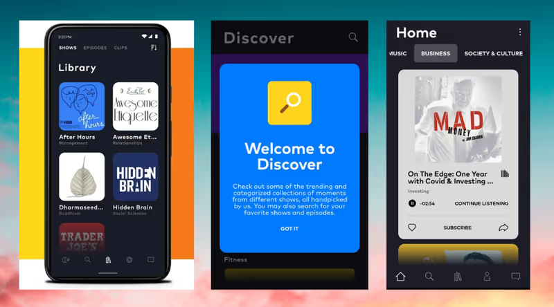
Over six months, I led a cross-functional initiative to redesign the user journey from the ground up, not as a series of features, but as a deliberate narrative. We partnered with the product and UX teams to create new feedback systems, content loops, and communication touchpoints. The result was a 30% increase in user retention and a significant lift in user engagement—all without a single major change to the core product. This is the story of how we stopped fixing features and started fixing the story.

From Disconnected Clicks to a Cohesive Narrative
Our first step was to move beyond simple analytics and build a qualitative, empathetic understanding of the user experience. We weren't just losing users; we were losing people with hopes and creative dreams. Why?
Our process began with a deep-dive diagnosis. I partnered directly with the UX and Product leads to conduct a series of user interviews and feedback sessions. We didn't just ask them what they disliked; we asked them to tell us the story of their first week on the platform. The patterns were immediate and undeniable.
Using this insight, we created a detailed User Journey Map. This became our foundational document. We mapped every single touchpoint a user had with Moonbeam in their first 14 days, from the initial sign-up email to their first collaboration request. For each touchpoint, we identified the user's action, their emotional state (e.g., excited, confused, frustrated), and the "narrative gap"—the place where the story we wanted to tell them diverged from the story they were actually experiencing.
This map revealed our core problem: our user journey was a monologue, not a dialogue. We were talking at our users, not building a relationship with them.
Designing the Narrative Loops
With our journey map as our blueprint, I proposed a new strategy centered around creating three interconnected narrative loops: a Feedback Loop, a Content Loop, and a Community Loop.
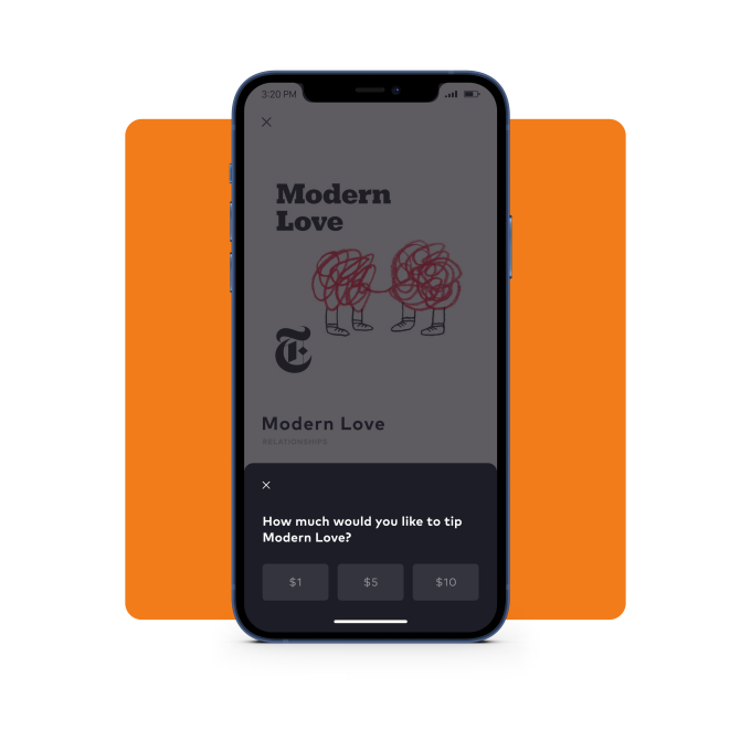
The biggest source of user frustration was a lack of feedback. They felt like they were shouting into a void. To solve this, we designed and implemented a new, automated system of notifications and prompts.
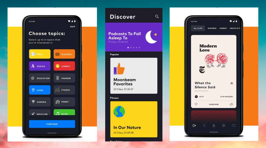
Our next challenge was to make the platform feel dynamic and constantly valuable, even if a user wasn't actively collaborating. I led the development of a new, curation-driven content strategy.
Finally, we needed to connect our users to each other outside of formal projects. We supported strategic pivots and growth marketing experiments to foster a sense of belonging. We defined product positioning and user journeys that encouraged users to join our new community forums and participate in weekly "collaboration prompt" challenges. This created a space for users to build relationships and feel like part of a movement, even before they landed their first big project.
A 30% Lift in Retention and a More Engaged Community
By redesigning the user journey as a cohesive narrative, we fundamentally changed the user's relationship with the platform. They went from feeling like isolated users of a tool to feeling like valued members of a community. The quantitative results were a direct reflection of this qualitative shift.
Over the two quarters following the implementation of our new journey design, we tracked a clear and sustained impact on our core business metrics:
Beyond the numbers, the biggest change was in the vibe of the community. The feedback we received shifted from "I'm confused" or "Is this thing on?" to "I was so excited to get a notification that a director viewed my profile!" and "Thank you for featuring my work in the newsletter!" We had successfully transformed the experience from one of passive waiting to one of active participation and hope. We proved that a well-designed narrative isn't just a "nice-to-have"; it's a core driver of the metrics that every product and business leader cares about most.
Three Truths About User Journey Design
This project reinforced three core principles that I now carry into every brand, product, and strategic challenge
We often think that adding one more feature will be the key to making users stay. This project proved that the story you tell a user—the way you guide them, give them feedback, and make them feel seen—is often more powerful than any single tool. A cohesive journey can make a simple feature set feel indispensable.
A new user arriving on a platform that feels quiet or static is a death sentence. Our content and feedback loops were designed to solve this "empty room" problem. By constantly showing the user that the platform was alive with activity, opportunities, and success stories, we gave them a reason to believe and a reason to stick around.
This project's success was entirely dependent on the tight collaboration between Creative, Product, and UX. The best ideas weren't born in a single department; they were discovered at the seams between them. My role as the "translator"—the person who could speak the language of user empathy, narrative design, and business goals—was the key to unlocking the solution. The most valuable leaders are the ones who can live in that intersection.
This experience at Moonbeam was foundational. It cemented my belief that a full-stack creative approach—one that blends storytelling, user-centric design, and operational rigor—isn't just a better way to make content; it's a better way to build businesses.
'UX Writing is More Than Microcopy—It's Narrative Design.'
See what our satisfied clients say about working with us.
Our proven process ensures successful outcomes and client satisfaction every time.
